A picture is worth a thousand words. The right picture is worth even more.
Background
As part of a broader data literacy initiative, my team was tasked with producing a series of introductory videos focusing on key data initiatives affecting the entire organization. The project started as a set of lunch-and-learn sessions with Subject Matter Experts (SMEs), covering topics such as Data Security, Master Data Management, and Data Governance. Each SME would deliver a ~30 minutes presentation—just enough information to give a new hire a solid foundation of knowledge for each topic—followed by a question-and-answer period.
This approach quickly hit two snags: first, with so many employees working from home, the in-person audience was inconsistent; and second, with everyone focused on eating lunch—especially remote attendees, who were shuffling between their desk and the kitchen—the Q&A was often sparse. So we scrapped the lunch-and-learn in favor of a podcast approach. The new gameplay was to interview a SME for about 30 minutes, going over their initiative at a high level, and skip the audience Q&A.
For each interview, we relied on the SME to provide slides related to the discussion. We would edit the slides for readability, focusing them on the key point(s) the SME wanted to make. (The SMEs knew their domains, but their PowerPoint skills often needed help.)
Projecting the flow of the conversation before the recording session was another matter. While we could easily clean up individual slides, it was tougher to figure out if something was missing until we completed the interview, because we never knew if—or when—a conversation might follow an unanticipated tangent. For the recording on Data Security, the conversation at one point went on for 10 minutes without anything to break it up, which ran the risk of tuning out the audience.
Implementation
So, how does one break-up a 10-minute conversation? In this case, with an infographic.
During those 10 minutes, the conversation had turned to the impact of data breaches as a way to stress the importance of data security. The SME had provided a few metrics emphasizing the impact of data breaches throughout the conversation, which were perfect for an infographic. We discussed the issue after recording the video, and decided to insert a slide in post-production. We started with 3 metrics on data breaches.
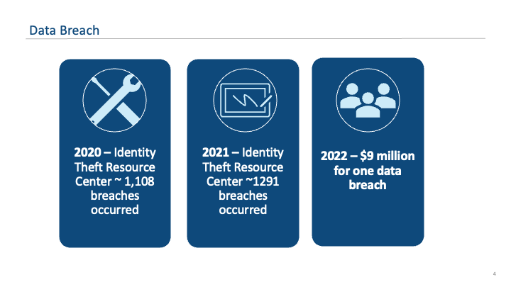
Looking at the first draft, using the 2020 and 2021 metrics on breaches felt too redundant, and the icons didn’t really match the metrics. So, I scrapped the 2020 metrics and instead emphasized the SME’s point about the cost of most data breaches, and found some more logical icons.
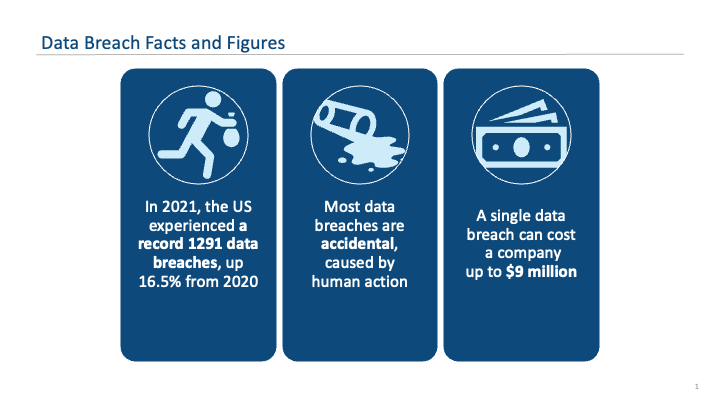
Now, the infographic told a better story in three succinct points:
- In the last year for which data was available (we were recording in 2022), the number of data breaches in the US jumped 16.5% year-over-year, to 1291, an all-time high.
- Most data breaches are the result of human error, so vigilance and caution are essential preventative factors.
- Mistakes can be costly: addressing a data breach could easily cost the company millions of dollars.
Adding this slide broke up the 10-minute conversation about halfway through, allowing us to tie together the SME’s points and keep viewers focused throughout the whole conversation.

Leave a comment